
12 restaurant menu tricks designed to make you spend more
Menu engineering was formally introduced in 1982 by hospitality professors Michael Kasavana and Donald Smith at Michigan State University. In the decades since, it has quietly become one of the most lucrative applications of behavioral psychology in any consumer industry.
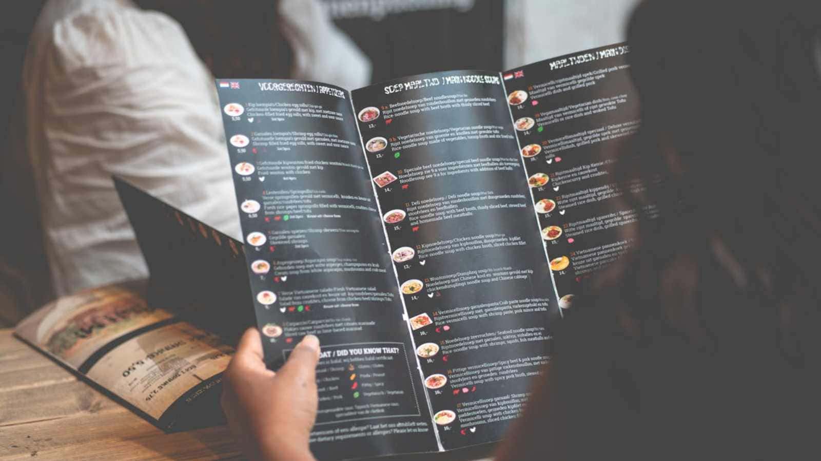
Restaurants don’t just list food. They construct a decision-making environment in which the average diner spends roughly 109 seconds before ordering, and nearly every one of those seconds is accounted for.
The person most associated with turning that academic framework into a commercial practice was Gregg Rapp, a menu engineer who spent over three decades redesigning menus for restaurants across the United States. His guarantee was blunt: within 30 days of rolling out a redesigned menu, a restaurant would see at least $1,000 in new profit, or he’d refund his fee.
One high-volume client saw $18,000 in new profit per week. He wasn’t changing the food. He was changing the document that sold it.
What follows are the 12 techniques baked into that document, the ones operating on you before you’ve consciously registered a single price.
The dollar sign is the most expensive character on any menu

One of its first moves is removing the dollar sign entirely. A Cornell University School of Hotel Administration study found that guests given menus without dollar signs spent significantly more than those given menus with dollar signs.
What’s strange still is that writing out prices in full, twelve dollars instead of $12.00, produced the same spending-reduction effect, because the written form still primes the brain for the discomfort of paying.
By stripping the currency symbol, restaurants dissolve that moment of flinching. You’re not reminded you’re spending money; you’re just selecting food you want. The number 18, sitting quietly after a description, feels more like a label than a price.
It’s a neat sleight of hand: technically transparent, functionally invisible. Cornell’s research found the absence of dollar signs drove an 8% increase in average spend – not a dramatic number until you multiply it across 200 covers a night.
How a $95 steak makes a $55 one feel like a bargain
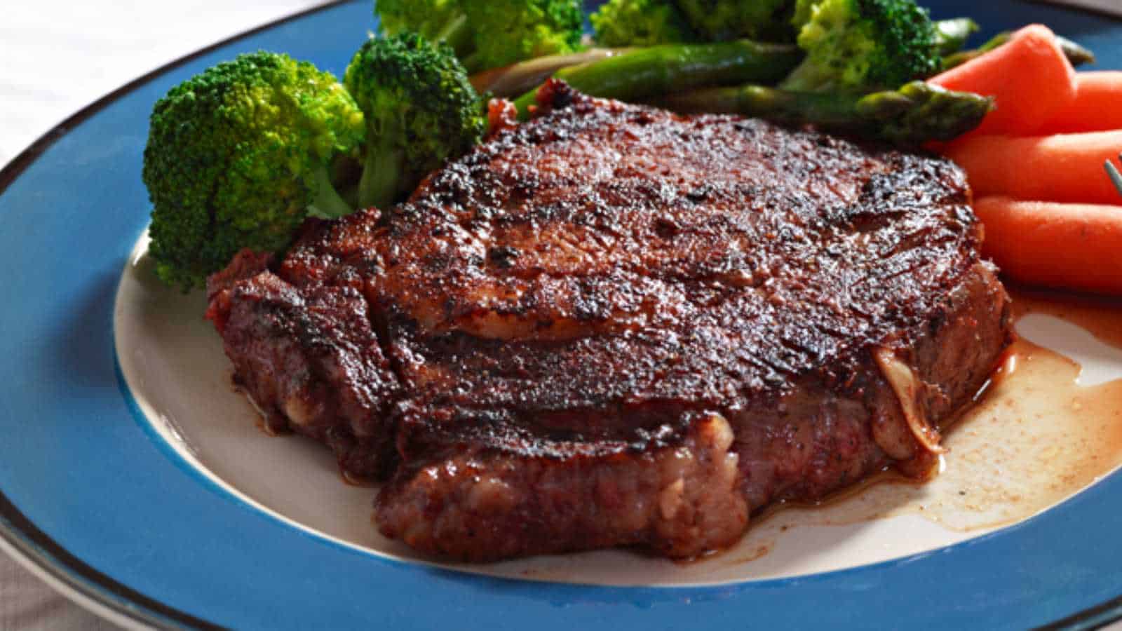
Nobody orders the lobster tower for $95. The restaurant knows that. It’s not there to sell – it’s there to make everything around it feel reasonable.
Economists call this anchoring, and it operates on a simple principle: humans evaluate prices not in absolute terms but relative to whatever they saw first. That $95 item recalibrates the internal meter, so the $55 steak no longer registers as expensive. It registers as sensible. Restrained, even.
It serves as a decoy item, and its placement near the top of the menu’s most-viewed section is no coincidence. Menu engineering, placing a high-priced specialty item at the top of each category, causes mid-range item selection to rise by 15%.
By placing higher-priced items (like appetizers or chef’s specials) first, customers set a high initial baseline, making subsequent items appear more reasonably priced and encouraging them to order more. The decoy doesn’t need to move. It just needs to sit there, quietly adjusting your sense of what normal looks like.
The second-cheapest wine is never the deal it appears to be
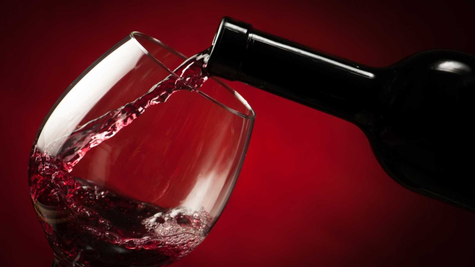
The psychology here runs on social embarrassment more than economics. Most diners instinctively avoid the cheapest bottle on a wine list – not because they’ve evaluated it but because ordering the cheapest option feels like a public declaration of frugality.
So they reach for the second-cheapest, believing they’ve struck a sensible compromise between value and dignity. Restaurants have known this for decades, and they price accordingly.
A 2021 study from researchers at LSE and the University of Sussex examined 6,335 wines across 249 London restaurants and found that the wines attracting the highest percentage markups were not the cheapest or the most expensive – they were the middle ones, from roughly the third to the sixth position on the list.
The second-cheapest was actually a relatively better value than most people assume. Where diners really pay a premium, the data showed, is anywhere in the median range – the exact territory that feels like the safe choice. The perceived sweet spot has the highest markup of all. The wine you chose to avoid looking cheap turns out to be the one costing you the most.
Descriptions that sell are written like small pieces of fiction

Slow-roasted, line-caught, wood-fired, hand-harvested – these words cost nothing to print and add nothing to the production of the dish, but they add measurably to what a customer is willing to pay.
A study published in the International Journal of Hospitality Management found that descriptive menu language raised sales by 27% compared to items listed without modifiers. Cornell’s research supported the same finding: more beautifully described items were rated as higher quality, regardless of the actual food.
The mechanism is sensory priming. Sun-dried evokes the Sicilian hillsides; slow-roasted conveys patience, craft, and time. These associations attach to the dish before the first bite, shaping how it tastes, how much it’s worth, and whether it gets reordered.
‘’The automatic, emotional brain – makes most of our snap decisions, with System 2 rationally justifying them afterward’’- Nobel laureate Daniel Kahneman.
The description bypasses deliberation entirely, selling an experience before the plate arrives. Restaurants have effectively turned adjectives into revenue.
Your eyes follow a script the menu already wrote

You are not reading the menu freely. Eye-tracking research shows that most diners follow a near-identical visual path: the center of the page first, then the upper right corner, then the upper left.
Menu engineers call this the golden triangle, and the most profitable items in any establishment tend to live squarely within it.
Restaurants also exploit a subtler effect: we subconsciously order the top one or two items in each menu section more often, so the first listing under any heading is almost always a high-margin dish. High-margin items also tend to get their own visual real estate – a box, a faint shading, extra whitespace – creating a spotlight effect, drawing the eye without announcing itself as advertising.
The whole architecture of a menu is a set of invisible directions, and the average diner follows them in about 109 seconds. That’s the total window restaurants have to move you toward what they want you to buy.
Limiting choices is a power move disguised as simplicity
At first glance, a tight menu feels considerate – curated, focused, less overwhelming. And it is. But the reduction in choice is also a financial calculation.
Psychologist Barry Schwartz argued in The Paradox of Choice (2004) that an abundance of options doesn’t liberate people – it paralyzes them. More choices produce more anxiety, more second-guessing, and ultimately less satisfaction with whatever is chosen. Restaurants use this insight with clinical precision.
The accepted standard in menu engineering is seven items per category, maximum – seven appetizers, seven mains, seven desserts. Once a category exceeds 7 items, guests become overwhelmed and default to something familiar rather than explore. That behavior may sound safe, but familiar orders tend to be lower-ticket.
A shorter, well-designed menu nudges diners toward the newer, higher-margin options the restaurant actually wants to push. Complexity can become a liability.
Nostalgia and foreign words both make the same item cost more

Naming a dish “Grandma’s Chicken Pot Pie” instead of “Chicken Pot Pie” is not sentimentality; it’s a revenue strategy. Nostalgia is a powerful emotional trigger in purchasing behavior.
It’s tied to feelings of warmth, safety, and self-generosity. Dishes that evoke family memories or childhood comfort feel more valuable before they arrive. The price stops being evaluated against market rates and starts being evaluated against the emotional value of the promised experience.
Foreign-language naming runs in parallel. Blanco Queso y Carne and White Cheese with Meat are the same dish. The first one signals authenticity, provenance, and cultural specificity – all of which function as quality proxies in the diner’s mind.
Both tactics accomplish the same thing: they shift the item’s perceived category from commodity to experience, and experiences carry a different price tolerance entirely.
Nested pricing makes the cost disappear into the description

On older menus, prices sat far to the right of each item, connected by a dotted line – the kind of design that made it trivially easy to scan the right column, find the cheapest option, and order accordingly. Modern menu design deliberately killed that format. Today, most professionally engineered menus use nested pricing, where the price follows directly after the dish description in the same font size, tucked in without visual separation.
The effect is that your eye reads straight through the description and past the number without pausing. There’s no right-hand column to scan, no visual shortcut to the cheapest item, no moment where price comparison feels natural.
The price stops behaving like the most important piece of information on the page. Removing those dotted lines was one of the quiet revolutions in menu design, and most diners never noticed it happened.
The colors you see before you read a word have already made a decision
Red increases heart rate, heightens neural stimulation, and has long been associated with appetite activation – which is why McDonald’s, KFC, and Burger King all built their global branding around it.
But a study by Szocs et al. added a more specific finding: red ambient color in restaurants leads to a greater preference for indulgent, high-calorie food choices, because consumers use environmental cues to infer the type of establishment they’re in and order accordingly. KFC’s sales reportedly increased after outlets were remodeled with red wall color.
Fine dining takes the opposite approach. Deep burgundy, forest green, matte black, and off-white communicate restraint and luxury – and restrained, luxurious environments suppress the impulse to compare prices against value. The diner is no longer asking, “Is this worth $42?” but rather experiencing something they’ve already pre-approved as worth whatever it costs.
Color also works at the micro level: green on a menu signals freshness and health; orange stimulates appetite and encourages lingering; blue is conspicuously absent from most restaurant menus because it suppresses appetite, a fact the industry absorbed empirically long before the research formalized it.
Photos sell more food, but only in the right quantity
A high-quality food photograph on a menu increases orders of that item – that part is consistent across the research. Restaurants that understand this use images sparingly, one or two per page at most, because selectivity is what gives the image its authority.
When every dish has a photo, none of them carries weight. The menu reads like a fast-food value board, and that association is hard to shake, regardless of the price points printed beside the pictures.
Fine dining avoids photography almost entirely, which is not an accident of taste. It is a calculated signal: the food here does not need to be sold to you with a picture.
Mid-range restaurants have applied the same logic differently: one well-placed, expensively shot image of a high-margin dish does more work than a full visual catalog ever could. Showing everything implies nothing is exceptional. Showing one thing implies everything else meets that standard.
The deeper irony is that the more a restaurant photographs its menu, the cheaper it tends to feel – even when the prices say otherwise. Perception runs ahead of arithmetic, and a menu dense with images has already told the diner what kind of place this is before a single dish arrives.
Music tempo and volume don’t just set the mood – they set the bill

A landmark study led by Dr. Adrian North found that playing classical music in a restaurant significantly boosts per-person spending by activating associations with affluence, refinement, and generosity. Diners in that environment report feeling more comfortable ordering premium items.
The same study found that pop music caused diners to spend 10% less, apparently because it triggered a more casual, value-conscious mental frame. The music wasn’t changing the food or the prices – it was changing the identity the diner temporarily adopted while eating.
Slow background music extends the meal, increasing the probability of a second drink, a dessert order, or a digestif. Fast music accelerates eating and table turnover, a trade-off fast casual restaurants accept willingly.
Some upscale establishments have begun using acoustic consultants alongside menu designers – professionals hired specifically to tune the dining room’s sonic environment toward higher spend. The idea that atmosphere is separate from the transaction has always been a polite fiction.
The menu that never actually ends is the one you can’t escape

QR code menus, online previews, and restaurant websites now function as the first draft of the same psychological document you’ll hold at the table.
Increasingly, the design logic of menu engineering – anchor items, descriptive language, color, image placement, visual hierarchy – has migrated entirely online, where it operates without the social awkwardness of being seen to deliberate. You can spend 20 minutes with the online menu at home and convince yourself you’ve made a free, unhurried choice. By the time you sit down, you’ve already been sold.
The menu is not a list. It never was. It’s the most consistently effective sales tool in the building, and it happens to be the one you hold in your hands and believe you’re reading on your own terms.
Key takeaways

- Restaurants treat menus as sales tools, not lists – every font choice, price format, and word placement is engineered to move you toward higher-margin items before you’ve made a conscious decision.
- Pricing psychology does most of the heavy lifting: removing dollar signs, hiding prices in descriptions, and planting an outrageously priced decoy item all work on the same principle: make spending feel smaller than it is.
- The menu controls where your eyes go, what feels like a safe choice, and how long you stay – through color, music, image selectivity, and a layout that has already decided which dishes deserve your attention.
- Language is the cheapest tool with the highest return – a 27% sales lift from adding descriptive words to a dish name costs nothing to implement and works because the brain prices experiences differently than ingredients.
- Knowing these tricks doesn’t fully neutralize them – the psychological mechanisms operate below the level of deliberate thought, which is precisely why a profession built entirely around exploiting them has existed for over four decades.
Disclaimer – This list is solely the author’s opinion based on research and publicly available information. It is not intended to be professional advice.
Like our content? Be sure to follow us